When designing a modern website, a well-constructed layout is crucial not only for aesthetic beauty but especially to ensure efficiency, adaptability, and development speed. If you want to create in Figma a design that perfectly integrates with the Bootstrap framework – today one of the most widely used standards in web development – it is essential to follow a series of technical guidelines.
Let’s see together how to correctly set up the work so that the transition from prototype to HTML/CSS code is smooth, precise, and without surprises.
Defining the Container and Basic Structure
The first fundamental element to consider is the choice of the container, the main holder of your content. Bootstrap offers two types of containers: fixed (.container) and fluid (.container-fluid).
The fixed container has predefined widths that adapt to various breakpoints (for example, 540px, 720px, 960px, 1140px, or 1320px depending on the version and screen size), while the fluid container occupies 100% of the available viewport width.
In Figma, you should create a frame that respects these rules. For projects intended for traditional desktops, it’s common to start by setting a width of 1140px or 1320px, centered on the canvas. If you are planning a full-width design, you can work at 100% viewport width from the start, while still maintaining inner margins to avoid content being too close to the edges.
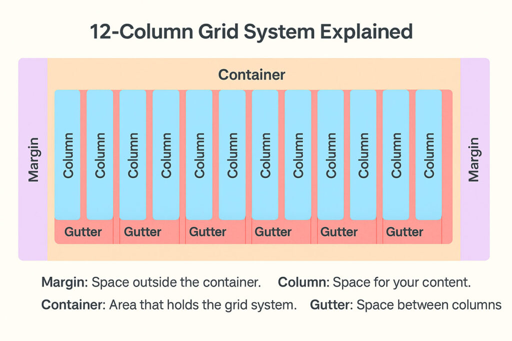
Creating the 12-Column Grid
One of Bootstrap’s core elements is its flexible grid system based on 12 columns.
In Figma, to align with this logic, set up a 12-column grid. You can choose the Stretch type to automatically adapt column width to the container size, or set Fixed Width if you prefer fixed, more precise column widths.
The gutter – the spacing between columns – should align with Bootstrap specifications: traditionally 30px (15px padding on each side of the column). Side margins must also be respected: at least 15px or more, depending on graphic needs and the Bootstrap version you are using.
The goal is clear: every element you design should align with the virtual edges of these columns to maintain visual consistency and facilitate accurate front-end code translation.
Adapting the Layout to Breakpoints
A modern website must work on every device, from mobile to desktop. Bootstrap helps you with built-in responsive breakpoints management, and your design in Figma must anticipate this logic.
Bootstrap traditionally defines breakpoints at:
≥576px (Small devices)
≥768px (Medium devices)
≥992px (Large devices)
≥1200px (Extra large devices)
≥1400px (X-Large, in Bootstrap 5)
Correct breakpoint management can be achieved in two ways: by creating separate frames for each size or by using Constraints and Auto Layout in Figma to simulate responsive behavior. In either case, your goal is to clearly show how the main elements reorganize or resize when the screen size changes.
Aligning Content and Maintaining Visual Consistency
Designing a grid is just the first step: the real work begins when you distribute the content.
Every section, title, image, or call to action must strictly respect the 12-column grid.
Avoid arbitrary movements or random sizes that are not logical multiples of the grid (e.g., a card occupying 4 columns, a form occupying 6 columns, etc.).
This graphic discipline allows you to maintain harmony, clarity, and visual balance, but above all, it will make the developers’ job faster and more efficient, reducing errors and revision times.
Also remember that vertical spacing between blocks (padding and margin) must be uniform and predictable: typically multiples of 8px or 16px, in line with modern design system standards.
Annotating and Documenting the Layout
A good design is not complete without proper documentation. When preparing a layout for development:
Specify the number of columns each element should occupy (col-4, col-6, col-lg-8, etc.).
If you expect different behaviors for various breakpoints, insert explanatory notes directly in the Figma file or in a supporting document.
If you use specific Bootstrap components such as navbar, carousel, accordion, buttons, or modals, it’s useful to annotate this or use component naming consistent with Bootstrap terminology.
This small documentation effort makes a huge difference when the project is handed over to the developer, avoiding misunderstandings and time loss.
Conclusion
Using Figma while following the Bootstrap grid system is a choice that pays off both during the design phase and the actual development.
A correctly set up layout ensures not only faster realization but also a higher-quality final product: more responsive websites, visually more consistent, and easier to maintain over time.
If you need to create customized, responsive, scalable, and SEO-optimized websites, contact me!